 밤에 가장 흥미로운 건축 조명 – 비주얼 가이드">

Begin with warm bulbs on facades facing the street; this sets an emotional tone and began by highlighting an accent rather than blasting luminance. As energy-saving options spread, designers gained precision in control, shaping how light reveals brick textures and stone details. Like a quiet beacon, the glow accentuates entrances and lines, creating a sense of place that invites pedestrians without glare. Place external luminaires below eye level to minimize spill and keep attention on the architectural rhythm, especially on the south elevation. The glow being gentle helps pedestrians feel welcome.
In practice, combining lighting for facades with garden considerations creates texture without overwhelming the street. The common scheme spreads light across cornices and columns, with controlled spill that doesn’t invade interiors. Like a quiet partner, warm bulbs complement cool accents, yielding a dynamic palette that stays legible from below and above. When night comes, the facade reveals its rhythm and the scene breathes with the glow.
Consider layering illumination: a base wash, accent beams on cornices, and the glow of garden edges. This common approach helps the viewer feel the sense of architecture without overpowering the street. By combining warm bulbs with subtle color accents, you create depth that reads clearly from below and from afar; the effect deepens as night settles.
Plan from a practical map: mark each facade, entrance, and garden edge. dont overload with color; keep to a consistent temperature. For the south side, avoid blasting with pure white light; instead, use warmer tones and controllable zones so the glow can be dimmed as activity shifts. Keep light under eave lines and shield fixtures to prevent glare on windows, preserving the sense of space and safety along steps and terraces.
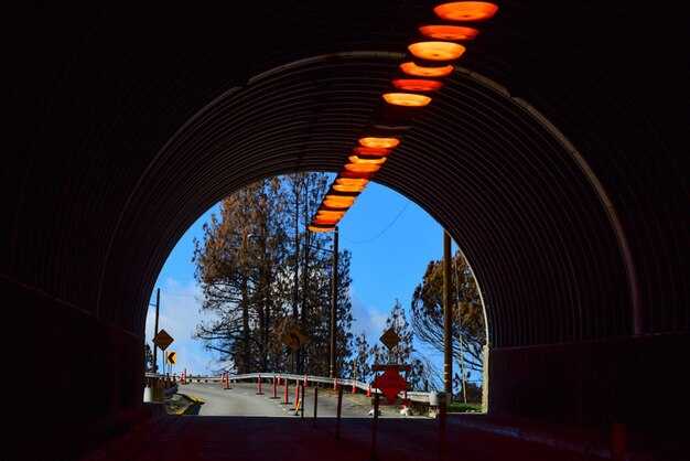
Nighttime Facade Enhancement: Practical Lighting Techniques
Start with a layered plan: uplight reliefs to sculpt depth, graze concrete planes to reveal texture, and apply selective highlights on anchors. Keep total output modest and set color temperature around 2700–3000K for an incandescent warmth that reads well at distance. Shield fixtures to prevent spillover, and run a dimmable circuit so brightness can be tuned as crowds arrive.
Areas under overhangs benefit from low-angle, shielded downlighting to avoid window glare while guiding pedestrians. Place narrow-beam fixtures at 15°–25° along vertical joints every 2–3 meters to preserve rhythm. Use cooler accents sparingly to avoid shifting the façade’s perceived mass; opt for warmth where you want approachability and safety.
Inspiration comes from Ronchamp: sculptural light should emphasize mass and form rather than wash the surface. Avoid flat illumination; emphasize creases, cornices, and recesses with controlled, directional beams. Similar approaches work on concrete facades by revealing their texture through careful contrast and highlighting the building’s silhouette against the sky.
The kersalé approach can help deliver sparkle on rough textures: place small, low-contrast beacons along edges to create a lively edge without overdoing it. Combine uplighting with targeted highlights on sculptural elements; use flash-level taps only on features you want emphasized, never on entire elevations. Youll notice depth increases where texture and shadow play off each other.
From a science standpoint, lighting design involves balancing efficiency with perception: measured steps in lux, color rendition, and flicker control influence well-being and perceived safety. Favor LEDs with CRI above 80, maintain 2700–3000K for human-friendly warmth, and employ dimming to avoid harsh brightness late at night. This change in approach reduces energy use while preserving the site’s appeal and readability during late hours.
Execution matters most: map every area, draft a three-layer plan (base wash, sculpting uplight, and feature highlights), test under conditions that mimic actual viewing distances, and adjust beam angles accordingly. Opt for modular fixtures for future re-aiming as the surroundings change, and document maintenance routines to keep the sparkle on those surfaces–especially near textured concrete–consistent over time.
Align Beam Angles with Facade Details to Highlight Texture
Place fixtures so the primary beam grazes the facade’s texture at a shallow angle (10°–15° relative to the surface) to reveal depth and grain. This keeps daylight cohesion and makes concrete, brick, and stone look more dimensional as daylight fades.
Here is a concrete method with specifics that you can apply on a typical elevation.
- Angle strategy by material
- Concrete: longer, narrow beams placed on the side of relief lines; grazing angle 8°–12° to describe formwork texture.
- Brick: 12°–20° to lift mortar lines and keep faces readable.
- Stone: 6°–14° to catch natural grain and edge details.
- Fixture placement and distance
- Mount fixtures just outside recessed areas, spacing 1.5–3.0 m along each bay; keep the beam centered on texture features for coherence.
- Height: place 0.5–1.5 m above grade for low facades and up to 2.5–3.5 m for taller ones; tilt to maintain grazing across the texture band.
- Electrical and control
- Use weatherproof, electrical dimmable LED fixtures with narrow to medium beam angles; 10°–25° grazing is typical; CRI > 80 for faithful color; provide soft-start.
- Single-zone control for synchronized side and uplight effects.
- Uplighting and side lighting synergy
- Combine uplighting to illuminate vertical surfaces with side grazing to describe texture; together they provide depth without washing detail.
- Testing and practical example
- Begin with a staged test plan: install around 12 fixtures along the chapel façade, using 2700K–3000K; record results and adjust in 5° increments. This example mirrors a setup described in a daylight magazine feature; began with concrete elements and refined after dusk, yielding effective, focused, illuminating results that enhance texture.
- Within daylight, the appearance reads clearly; the dream of a rich surface becomes very legible when viewed from mid-level angles.
- The dame niche on the entrance was illuminated to emphasize its relief.
- Use a lighter 3000K option in select bays to create contrast.
- Materials and textures to watch
- Concrete with formwork marks responds to grazing; brick mortar lines gain crisp edges; natural stone shows fissures more clearly with grazing beams placed on the side of the relief.
- Case example
- Dame Chapel, a project described in a daylight magazine, began with placed fixtures along the side to illuminate recesses; the longer throw provided depth, and the result was very effective for day-to-night transitions.
Use Grazing, Wall-Washing, and Silhouette Techniques for Depth
Position fixtures strategically along the base of the wall, 0.6–1.2 m from the surface, and tilt 5–15° upward to carve texture. Use 3000–3500K, CRI > 90, and avoid glare on glazing. In a european streetscape, this approach becomes popular for casa facades at night, with energy along the wall enhancing texture and providing a particular appeal to those youre targeting as part of the neighborhood identity.
Wall-washing specifics: Position fixtures 1.5–4 m from the wall with beam spreads of 60–90 degrees to achieve even illumination across large, flat surfaces; space fixtures 3–6 m apart for long facades. Opt for opal diffusers and adjust intensity to preserve gray tones of stone or plaster. Target wall luminance around 10–40 cd/m² and address different aspects of reflectance; keep color temperature in 2700–3200K to maintain natural warmth and release a sense of life after hours.
Silhouette technique for depth: Backlight selected elements such as ironwork, screens, or planters from 2–4 m away with a narrow beam of 6–12°. Keep the intensity low to avoid bloom while creating crisp side outlines and meaningful negative space. This instance of layering makes the structure feel three-dimensional, likewise aligning with aspects of texture that read across the night and along walkways on those areas.
Volharding and multi-layer calibration: A volharding approach blends grazing, wall-wash, and silhouettes to transform flat elevations into depth-rich surfaces. Begin with grazing on the lower band, add wall-wash to even the broader planes, then place silhouettes on side elements to define shapes. This method ensures coherence with nature along the façade and inside adjacent spaces; it also supports advertising readability for those planning outdoor displays and areas to visit after dusk, while providing a consistent glow for nearby casa and neighborhood parts.
Practical tip: When setting up, test at least three scenes: early evening, peak activity, and late night. By adjusting only the angle and intensity, you’ll see how opal diffusers and gray materials read differently and how the european casa gains popular appeal. Likewise, the process of transforming dull façades into dynamic parts of the urban fabric becomes a model for advertising areas, ensuring energy efficiency that provides a natural inside glow for those youre monitoring.
Calibrate Color Temperature and CRI for Night Atmosphere
Set the primary ambient color temperature to 2700K and maintain CRI 90+ for most night-time spaces; for exterior accents, use up to 3000K to preserve warm whites on plaster and white homes, ensuring skin tones read accurately while texture details on facade read as intended.
적용된 레이어링이 중요합니다. 3계층 방식(앰비언트, 작업, 액센트)을 사용하고 각 계층을 2700–3000K 이내로 유지하십시오. 디밍 시 50K 이하의 색상 변화만 허용하십시오. 불일치를 방지하려면 단일 보드 또는 제어 콘솔의 모든 조명 기기에 대해 동일한 색온도를 목표로 하여 전기 건물이 야간에 최종 승인을 받을 때까지 더 크고 응집력 있는 구성을 보장하십시오.
CRI 공간별 목표: 욕실은 정확한 흰색과 화장품 표현을 위해 CRI 95+ 필요; 거실 및 생활 공간은 만족스러운 색상 충실도를 위해 90+; 주방 및 작업 공간은 85–90; 외부 작업은 색상 표현이 중요하지 않은 경우 CRI 80+로도 가능하지만, 심야 각도에서 표지판 및 재료를 정확하게 판독해야 하는 경우 90+ 등급의 램프를 선택하십시오. 이 지침은 흰색과 질감의 품질, 즉 색상 충실도를 유지하는 데 도움이 됩니다.
실질적인 고려 사항: 대형 건물의 경우 모든 층에 걸쳐 표준을 적용하고 중앙 제어 보드를 사용하여 색온도를 정의된 범위 내로 잠그십시오. 여러 방에서 색도계로 측정하여 판독값이 ±50K 내에서 일치하는지 확인하십시오. 핀란드 환경에서는 석고 질감을 보호하기 위해 2700K를 유지하십시오. 로스앤젤레스 프로젝트에서는 형태를 강조하기 위해 흰색 표면과 깊은 그림자를 강조하는 동시에 기술과 스마트 디밍을 통해 에너지 사용량을 억제하십시오.
또한, 객실 간의 일관성을 유지하여 갑작스러운 변화를 피하고, 균형 잡힌 스펙트럼을 가진 고연색성 조명을 선택하십시오. 내부 공간에서는 2700–3000K, 깊고 조용한 야간 조명이 필요한 특정 외부 액센트에는 2000–2500K로 편향시켜, 더 먼 거리나 대중과 함께 낮에 볼 때도 접근 방식이 만족스럽고 일관성을 유지하도록 합니다.
차폐 및 구역 설정을 통해 눈부심 및 빛 공해 최소화
권장 사항: 완전 차단 조명 기구를 건물 가장자리에 배치하고 통합 차폐 장치 사용, 조명은 지면과 특정 지점에만 집중하며 창문으로 새어 나가지 않도록 배치합니다.
차폐 툴킷: 내구성이 뛰어나고 UV에 강한 재료로 제작된 패널, 루버 및 배플은 미광을 줄여줍니다. 하우징 내부에 흰색 마감재를 사용하여 눈부심을 최소화하고 파사드 전체에 걸쳐 일관된 외관을 유지하십시오. 유출을 증폭시키는 반사성 또는 광택 표면은 피하십시오.
구역 설정 전략: 해당 영역을 정원 인접 구역, 휴식 공간 구역, 주방 창문 인근 구역, 조각상 강조 구역, 그리고 진입 구역으로 구분합니다. 정원 및 조각상 구역에는 더 긴 투사 거리를 할당하고, 휴식 및 주방 인접 구역은 실내의 편안함과 색상 정확도를 유지하기 위해 낮은 수준으로 유지합니다. 급격한 변화 없이 구역 간의 대비를 유지하기 위해 디밍 가능한 LED를 사용합니다.
창문 및 외관 고려사항: 실내로 향하는 시선에서 조명 기구를 멀리 배치하십시오. 빛이 위층 창문으로 올라가지 않도록 차광막을 고정하십시오. 빛이 유리로 향하기 보다는 포장 및 화단에 비추도록 아래쪽 각도로 더 높은 벽 높이에 설치하는 것을 선호합니다.
제어 및 타이밍: 점유 센서 및 천문 타이머를 구현하여 기간 시작 후 출력을 줄입니다. 늦은 시간까지 최대 용량의 20–30%를 목표로 하고 마지막 단계에서는 5–10%로 줄입니다. 이를 통해 주변 거주자나 조각상 검사에 불편을 초래하지 않으면서도 공간을 쾌적하게 유지할 수 있습니다.
재료 및 미학: 차분한 색조의 가볍고 내구성이 뛰어난 하우징을 선택하십시오. 숨겨진 하드웨어는 시각적 방해를 최소화하면서도 오래 지속되는 유지 보수가 적은 시스템을 유지합니다. 패널과 쉴드는 창틀 및 정원 경계와 조화를 이루도록 설계되어 우연한 느낌보다는 의도적인 느낌을 주는 응집력 있는 외관을 만들어야 합니다.
유럽 맥락: 베를린 및 다른 유럽 도시들은 역사 지구에서 엄격한 차폐를 시행합니다. 야간 미관을 보존하면서 도시 기준을 충족하기 위해 더 긴 투사 디자인과 차폐된 조명 기구를 적용합니다. 에너지 낭비를 줄이고 더 긴 실외 기간 동안 신중한 배치를 지원하는 인공 조명을 통해 지속 가능성 목표를 뒷받침합니다.
스마트 컨트롤 구현: 디밍, 스케줄링, 장면 관리
벽과 방 전체에 걸쳐 일관된 조명을 보장하기 위해 디밍, 스케줄링, 장면 신호를 관리하는 중앙 집중식 스마트 제어 허브를 설치하십시오.
컨트롤러와 조명 기구 간의 안정적인 통신을 보장하기 위해 표준 프로토콜(Zigbee, DMX, KNX)을 사용하는 영구 설치를 채택하십시오. 응용 분야는 갤러리, 로비 및 공공 복도에 걸쳐 있으며, 단일 공간을 넘어 재현되면서도 각 영역에 맞게 조정된 고유한 장면을 설계할 수 있습니다. 프로세스는 일광, 벽 마감재 및 거울 표면에 대한 빠른 감사로 시작하여 센서 배치, 배선 및 시운전으로 이어집니다. 남향 구역에서는 가시적인 대비를 유지하기 위해 더 높은 디밍 범위로 일광을 보정합니다. 조명 선택은 인지되는 깊이에 영향을 미치므로 부드러운 전환을 계획하고 갑작스러운 변화를 피하십시오.
귀하의 팀을 위해 시스템은 작동하기 쉬워야 합니다. 구역별 밝기 조절, 장면 불러오기, 변경 사항 예약 등이 가능해야 합니다. 컨트롤러를 가장 접근하기 쉬운 곳에 배치하여 지속적인 조정이 일상적인 워크플로우의 일부가 되도록 하고, 동일한 컨트롤을 사용하여 통일된 미관을 유지하면서 여러 방에 서비스를 제공할 수 있어야 합니다. 그러나 관리가 용이하고 나무랄 데 없도록 표준을 유지하기 위해 컴팩트한 장면 세트로 시작하여 필요에 따라 확장하십시오.
| 양상 | 접근 | 근거 |
|---|---|---|
| 디밍 전략 | 부드러운 페이드로 0-100%; 로그 곡선 사용 | 미학 유지, 눈부심 방지, 에너지 소비 감소 |
| Scheduling | 점유 기반 및 천문 시계; 일출/일몰 포함 | 에너지 효율, 시간대별 쾌적한 수준 |
| 장면 관리 | 영역당 3~5개의 프리셋: 주변, 작업, 강조, 발표; 영역별 그룹 컨트롤 | 동일한 공간에 대한 다양한 시점; 빠른 장면 리콜 |
| 배치 및 통합 | 입구 근처와 남쪽 벽에 컨트롤러, 표면을 덮도록 배치된 설비 | 균일한 커버력; 거울의 원치 않는 반사 최소화 |
| 품질 & 에너지 | 높은 CRI LED(>90); 드라이버는 연속 디밍 지원 | 필수적인 품질; 최적의 에너지 사용은 정확한 색상과 밀접한 관련이 있습니다. |
 모스크바 최고의 분위기 있는 루프탑 바 – 최고의 하늘 위 전망">
 아름다운 자전거 도로 9곳 – 세계에서 가장 경치 좋은 자전거 여행">
 요가 및 명상 수련회를 위한 최고의 여행지">
 수 세기 된 정원 – 세계에서 가장 오래 지속되는 역사적인 정원">
 활짝 피어나는 봄 – 싱그러운 꽃, 정원 가꾸기 팁 및 계절별 영감">
 불편한 좌석에도 맥주 한 잔 – 독자들이 가장 좋아하는 트램 노선">
 여름 파티를 위해 정원을 스타일링하는 방법 – 쉬운 장식 아이디어">
 정원을 위한 25개의 작은 연못과 폭포 – 최고의 뒤뜰 워터 기능">
 시카고 홀리데이 라이트 명소 – 최고의 전시 및 투어">
 저렴한 예산으로 모스크바를 여행할 수 있을까요? 알뜰 여행을 위한 실용적인 팁">